
Introduction
While there were no glaring flaws to be found, the L47WT50 didn’t run the race with the same efficiency as the P65VT50. The L47WT50 comes loaded with features, but its core performance—color accuracy and contrast ratio—is average.
Design
{{section_header}}{{section.name}}{{/section_header}}
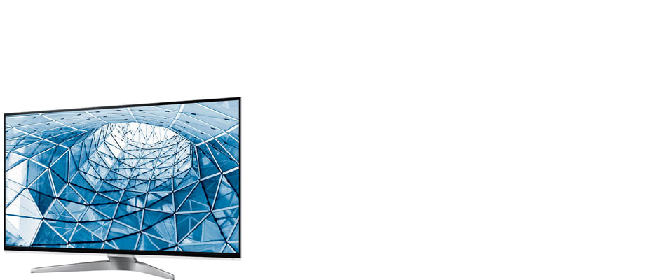
The WT50 sports the handsome design and sleek build worthy of a company's flagship.
It slices, it dices. Okay, it doesn't do any of that, but the WT50 is a very good looking TV. The thin, metal bezel, narrow panel depth, and curved crescent stand combine into a modern, stylish whole.
When it comes to usability, the WT50 has all of the bases covered. It makes use of side and rear placed connectivity options to hide them from sight while leaving them completely accessible. The same can be said of its control buttons. As a flagship TV, a modicum of high-end connectivity options is expected, and the WT50 delivers. It offers a standard array of traditional connectivity options, including three USB ports and four HDMI inputs.
{{photo_gallery "Design Landing Page Photo", "Front Tour Image", "Back Tour Image", "Sides Tour Image", "Connectivity Tour Image 1", "Connectivity Tour Image 2", "Connectivity Extra Photo", "Stand Photo", "Controls Photo", "Remote Control Photo"}}
Smart TV Features
{{section_header}}{{section.name}}{{/section_header}}
A comprehensive menu system, coupled with Panasonic's Viera Connect smart platform
Working with this TV is just as rewarding as looking at it. Panasonic's system menus are intuitive and streamlined. It’s easy to jump in and change picture or audio settings, and Panasonic has done a fine job keeping its menus packed to the gills with options. Needless complication may be the name of the game in HDTVs these days, but Panasonic has patched things up in an admirable way.
Panasonic’s Smart Platform, Viera Connect, is sort of a B-list platform compared to the 2012 showings from Samsung and LG, but not because of its content offering.
The content available is comparable with content provided by the competition; but the difference is always in organization and presentation. Panasonic’s stacked pages of menus are an improvement over 2011’s set-up, but the big, slow-loading windows for each content offering are unnecessary and clunky. You’d get used to them, but the whole thing would benefit from a simpler presentation.
{{photo_gallery "Software and Internet Landing Page Photo", "Internet Features 1 Photo", "Internet Features 2 Photo", "Internet Features 3 Photo", "Browser 1 Photo", "Browser 2 Photo", "Browser 3 Photo", "Apps 1 Photo", "Apps 2 Photo", "Apps 3 Photo", "Local Media Playback 1 Photo", "Local Media Playback 2 Photo", "Menu Main Photo", "Menu 2 Photo"}}
Picture Quality
{{section_header}}{{section.name}}{{/section_header}}
Overall, the WT50 is not a bad performer, but its mantle of "flagship" had us convinced it would be more impressive.
When our staff ruminates about performance, we jump straight to a TV’s ability to perform its most basic functions. When a 47-inch TV, which we’d call medium sized, requires over two-thousand greenbacks to get it from the store to your living room, we expect it to outperform lower-rung models in things like color accuracy and black/white differentiation on screen.
For this reason, we're a little disappointed by the L47WT50. It doesn’t have any major weaknesses, matched by a dearth of major strengths. Its color accuracy was decent, but its contrast ratio—the second most important performance area—tested below average.
3D
{{section_header}}{{section.name}}{{/section_header}}
While far from perfect, we would still peg the WT50’s 3D as above average.
There are two major areas we judge when viewing a TV’s 3D: immersion, and performance. The immersion side of that spectrum has to do with the extremity of depth we see or in other words: how convincing is the 3D? We’ve found that 3D TVs with very little depth are usually free of crosstalk (ghost images), with the trade off of unconvincing 3D. 3D TVs with a lot of depth, however, often struggle with crosstalk during “in your face”-style imagery.
The Panasonic Viera TC-L47WT50 falls into the latter category. Its 3D middle- and background look superb and gave us a real sense of looking beyond the 2D plane. Close-up images and effects, however, made us a little uncomfortable with the way the popping images tended to blur and crossover into the wrong eyes. Even if this only happens every 15 minutes during a movie, it’s fairly distracting.
Conclusion
{{section_header}}{{section.name}}{{/section_header}}
The WT50 is a decent package for the cost, but considering its place within the Panasonic hierarchy, it should perform at a much higher standard.
The Panasonic Viera TC-L47WT50 (MSRP $2299) is a good TV. It sports mostly accurate colors, passable contrast, a usable smart platform, and decent 3D. Noticing a distinct lack of praise? That’s because a $2000+ flagship TV from a company like Panasonic should be a lot more than simply “good.”
The bottom line is, if you’re shopping for a TV with the works that will fulfill your expectations, the L47WT50 is a fine choice. But if you want to specialize—and get the most out of your money—there are plenty of less costly TVs that can give either better color accuracy, better contrast, better 3D immersion, or a more fluid smart platform.
Science Introduction
{{section_header}}{{section.name}}{{/section_header}}
Going into testing for the Panasonic L47WT50, we had high expectations. Our initial thoughts were: "This is Panasonic's flagship. Even if the company specialize in plasmas, their top-tier LCDs are still bound to impress." That idea, coupled with the WT50's stylish appearance, had us rooting for it. Unfortunately, its performance was wholly underwhelming, not just for a flagship TV, but within the realm of LCDs in general.
Contrast
{{section_header}}{{section.name}}{{/section_header}}
The WT50's impressive brightness destroys the integrity of its black level.
Contrast ratio is the measure of a television's peak brightness, or brightest possible output, divided by its black level, or dimmest possible output. The resulting number tells us a lot about a TV's viability in numerous areas, the most important being a mix of immersive qualities and legibility. Our staff generally considers the smallest acceptable contrast ratio for a television to be 1000:1. Compare this to computer monitors, which display just fine at 200:1 or 300:1.
That is why a 957:1 contrast ratio on a flagship LCD is so disappointing. It's below average, yes, but more importantly, it isn't above average. The very idea of a flagship product is that it should push beyond acceptable results to exceptional results. The WT50's black level of 0.38 cd/m2 is very bright—watching it in the dark would make you all too aware that you were staring at a screen. It'll look just fine in a bright environment (like a retail show floor), but these results are still a bane to movie lovers everywhere. More on how we test contrast.
{{photo_gallery "Science Section 1 Images"}}
Color
{{section_header}}{{section.name}}{{/section_header}}
The WT50's undersaturated blue point harms the integrity of its color accuracy.
A color gamut is an illustrative aid to demonstrate by set standards the millions of colors a display device--like a TV--is able to display. Rec. 709 is the current international standard for display technology, and dictates the ideal gamut for HDTVs. It's what we compare all of our lab results to, and it's the best way to reveal a TV's color-related shortcomings.
The WT50's color gamut wasn't horrible, but the way it matched up to the Rec. 709 standard was much worse than we were expecting. The white triangle represents the WT50's gamut results; the black represents the HDTV ideal. As you can see, the WT50 missed the red and green points (relating to those colors) by a small amount. The blue point, however, is where the real problem lies. It is considerably undersaturated to the point where a wide spectrum of blues will be lost, resulting in less diversity in picture. More on how we test color performance.
{{photo_gallery "Science Section 2 Images"}}
Other Tests
{{section_header}}{{section.name}}{{/section_header}}
{{photo_gallery "Other Tests Images"}}
Meet the tester

Lee was Reviewed's point person for most television and home theater products from 2012 until early 2022. Lee received Level II certification in TV calibration from the Imaging Science Foundation in 2013. As Editor of the Home Theater vertical, Lee oversaw reviews of TVs, monitors, soundbars, and Bluetooth speakers. He also reviewed headphones, and has a background in music performance.
Checking our work.
Our team is here for one purpose: to help you buy the best stuff and love what you own. Our writers, editors, and lab technicians obsess over the products we cover to make sure you're confident and satisfied. Have a different opinion about something we recommend? Email us and we'll compare notes.
Shoot us an email